In 2020, the publishing company Artmed - reference in Brazil and abroad for publishing the best knowledge in medicine and education - made another step in the mobile era. This is the story of how I made a positive difference to clinical decisions in Brazil.
I have omitted and appropriated confidential information.
MY ROLE
I was part of the pitch team and responsible for the experience estrategy and design of the iOS and Android app. I led the UX work, producing all major deliverables and presenting these to the client between October 2019 and May 2020.
The Challenge
1 APP IN 2 MONTHS
Our client approached us with an objective - to bring the content of his books to a mobile application, having the use approved by the medical society through user testing.
We were tasked to deliver an iPhone high-fidelity prototype to our client within 2 months. The combination of a fixed deadline and app store submission time meant I needed to get an agile approach with the programmers to run the design work at the same time as the coding.
We were tasked to deliver an iPhone high-fidelity prototype to our client within 2 months. The combination of a fixed deadline and app store submission time meant I needed to get an agile approach with the programmers to run the design work at the same time as the coding.

Even more quick
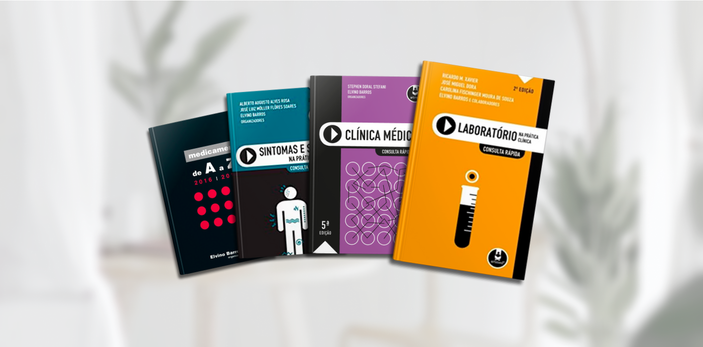
Consulta Rápida is a series of books for quick consultation, like the traditional booklets used by resident doctors. In fact, the idea is already old and was born from the need to have practical and accessible material when attending patients by students, resident doctors and clinicians. To facilitate the search for subjects, the chapters have been divided into the various areas, and the contents are presented in alphabetical order.
Each piece of information is based on established literature, and we recommend that it serve not as an exclusive source, but as an aid in daily medical practice.
Each piece of information is based on established literature, and we recommend that it serve not as an exclusive source, but as an aid in daily medical practice.
The Approach
Focusing on usability
Although our brief was to develop better design than our client's competitors, we stressed that engaging in a visual quality war was neither strategic, nor had the best interests of the app's users at heart.
To differentiate ourselves in an already mature and competitive market, we needed to define a desirable role for the app and how it would meet the needs of the scheme's users. We were thrilled by the opportunity to create something more meaningful.
To differentiate ourselves in an already mature and competitive market, we needed to define a desirable role for the app and how it would meet the needs of the scheme's users. We were thrilled by the opportunity to create something more meaningful.
Darius Kumana and Jon Dickinson's Agile and User-Centered Design heavily influenced our product strategy.
Lean UX
We opted for a lean approach which emphasised rapid sketching, prototyping, user feedback and design mockups. This created early team‐wide alignment, sparked tons of great ideas and created a strong sense of ownership across different disciplines within my organisation.
Building trust through transparency
Sharing our methods and thinking from the outset helped to build a strong client relationship. Ample opportunities for input at all stages of the project built trust and created a comfortable environment to share ideas—forming a partnership which will serve much value beyond this phase.
one platform testing
Because of the project timeline and fixed date, we opted to build for iOS platform first which allowed for prototyping and user testing without overloading all the team. It was a good choice because the tested users was mostly iOS and the team had other projects running at the same time
Starting on the same page
Meeting with key stakeholders helped us to understand their business challenges. Together we identified risks and aligned on expectations and constructed a shared vision for the app. Following this, I crafted an experience strategy outlining our phased approach and direction for the app.
The discovery
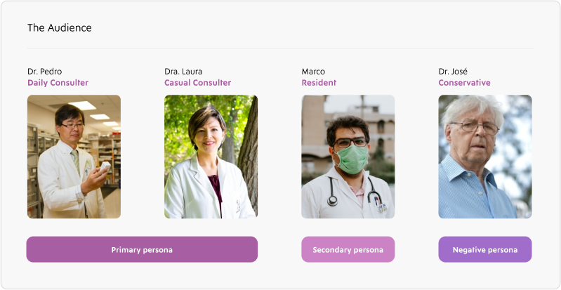
What does the "consult" mean to you?
The discovery phase was a quick, high‐intensity effort that allowed us to define project milestones, review the competitor landscape, understand our client's vision, and begin research into user needs, behaviours and pain‐points.
Our research revealed that the concept of 'consult' represented something different to users of the scheme. Users' motivations for consulting and participating in the scheme differed, hinting at different requirements.
After designating persona types and aligning this with our phasing strategy we were able to prioritise who we would be focusing on supporting in the early stages. The phase 1 app focused on supporting the goals of Pedro and Laura, our primary personas. We planned for later phases to support Marco and José.
We used personas constantly throughout the project to guide design decisions, priorities, and create empathy amongst the client and our team.
"We used personas constantly throughout the project to guide design decisions, priorities, and create empathy amongst the client and our team."
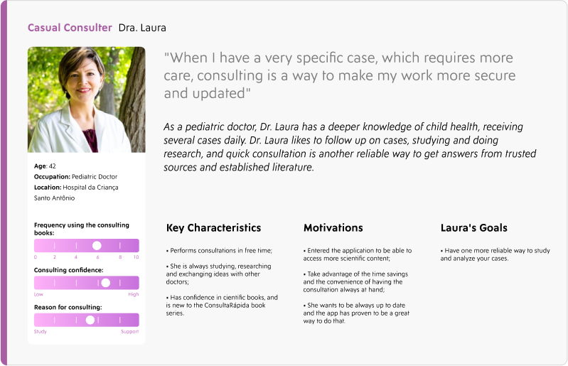
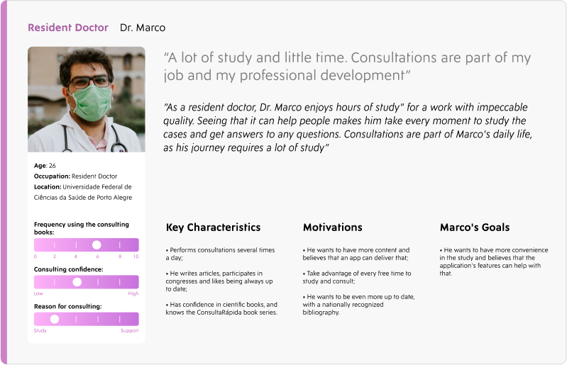
Our persona hypothesis consisted of four different archetypes which we used to facilitate discussions about our users needs, desires and varying contexts of use. Through careful analysis of our research, we identified sufficient behavioural variables to segment our user audience. These variables could be categorised into activities such as frequency of use of the scheme, skills such as consulting confidence and motivations such as reasons for consulting.

First Sketchs
The customer already has an initial draft of what the solution might look like. Several screens, many "hamburger" menus, content categories, and a flow of use still initial.
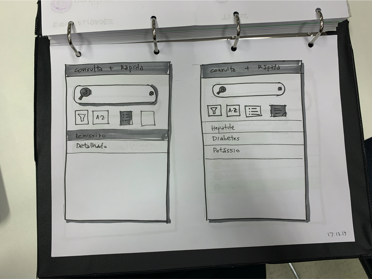


New Wireframes
We held some meetings with the client and started rethinking the sketchs into a simple user flow. I had about 1 month, from October 9 to 20, to create the wireframes, applying the flow and creating a low quality prototype.
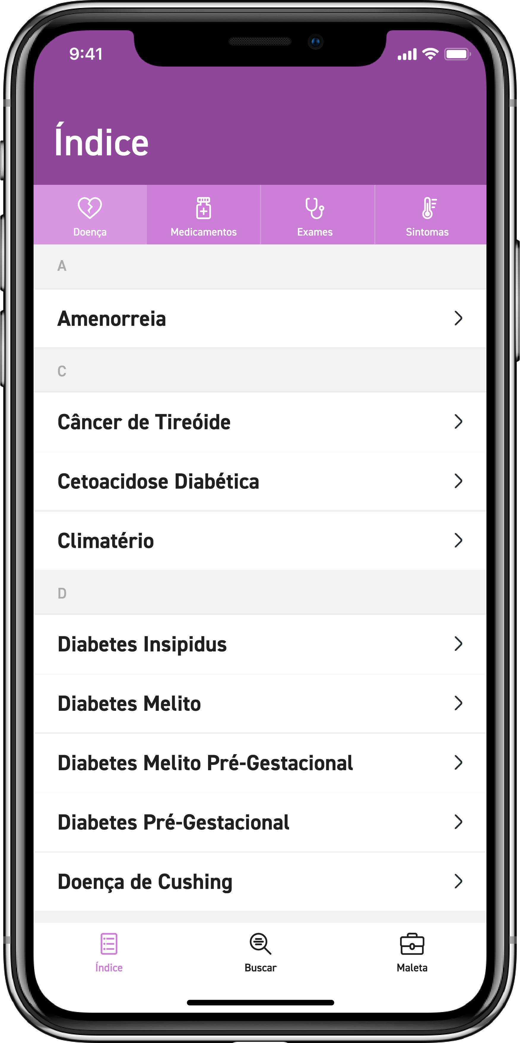
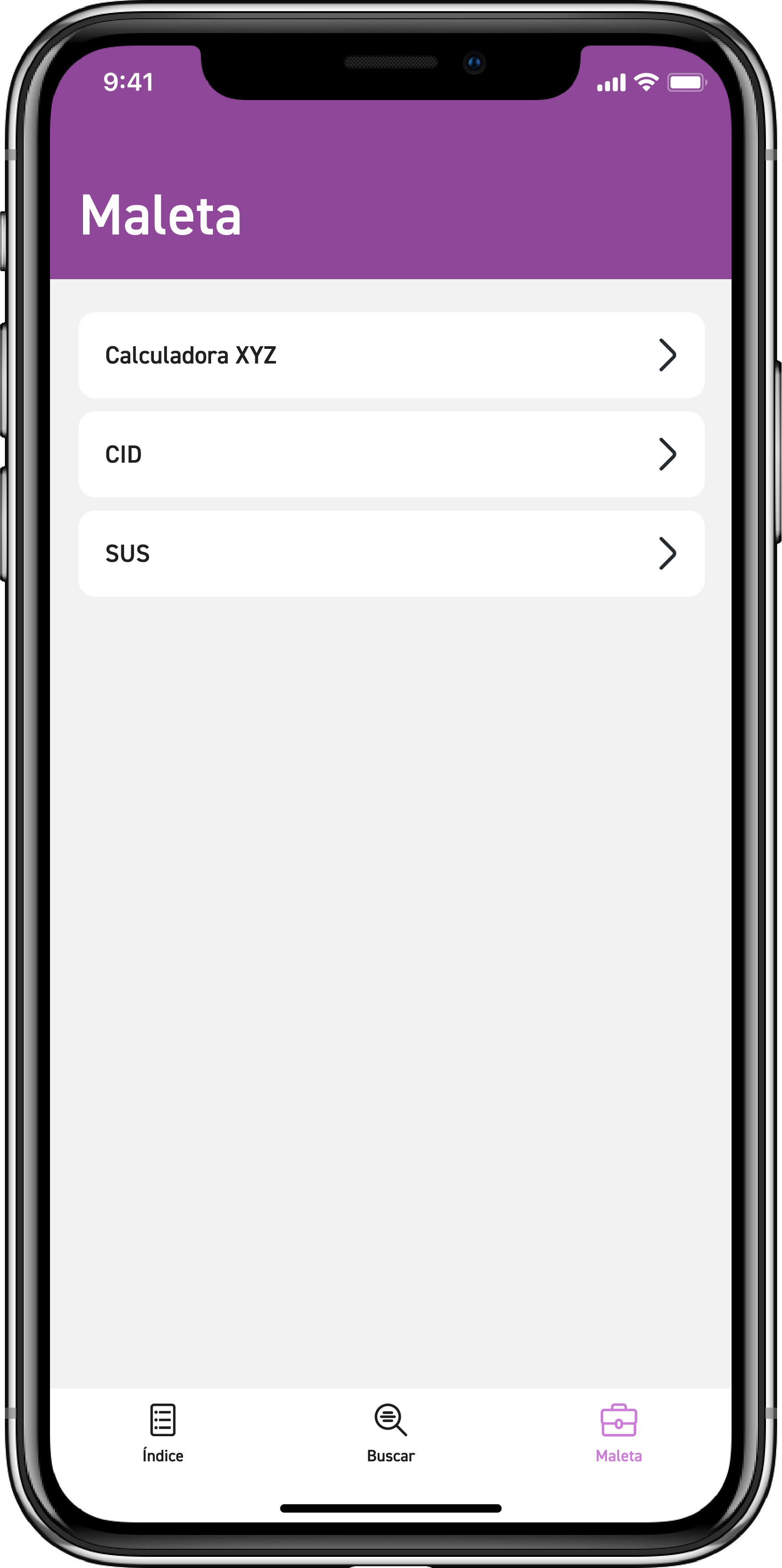
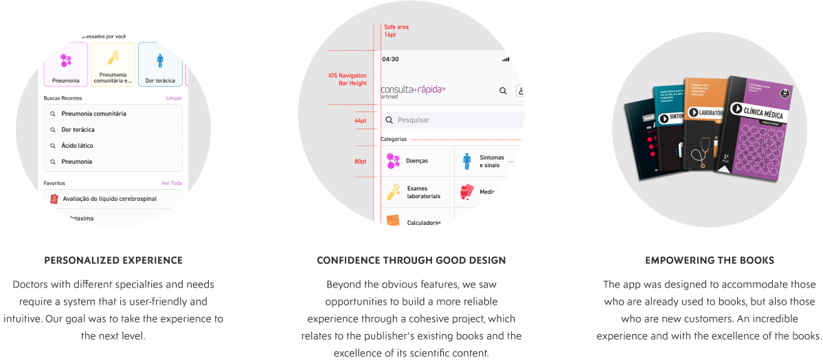
The idea was to allow the user to browse through the content, finding several different categories. We defined 3 important screens fot the tab bar: an index to view the content in a list, with an alphabetical and category filter; a search screen with filters; and a screen with various tools, such as medical calculators, disease discovery by the International Classification of Diseases and other tools to be defined by the customer.
Final design
After a meeting with the client, we had the wireframes tested and validated. I started the final design of the screens, to produce a high-fidelity prototype in the end. As our test device would be iOS, I focused on designing an interface with elements based on the Apple Design system, but changing fonts and colors for greater identification with the book series.
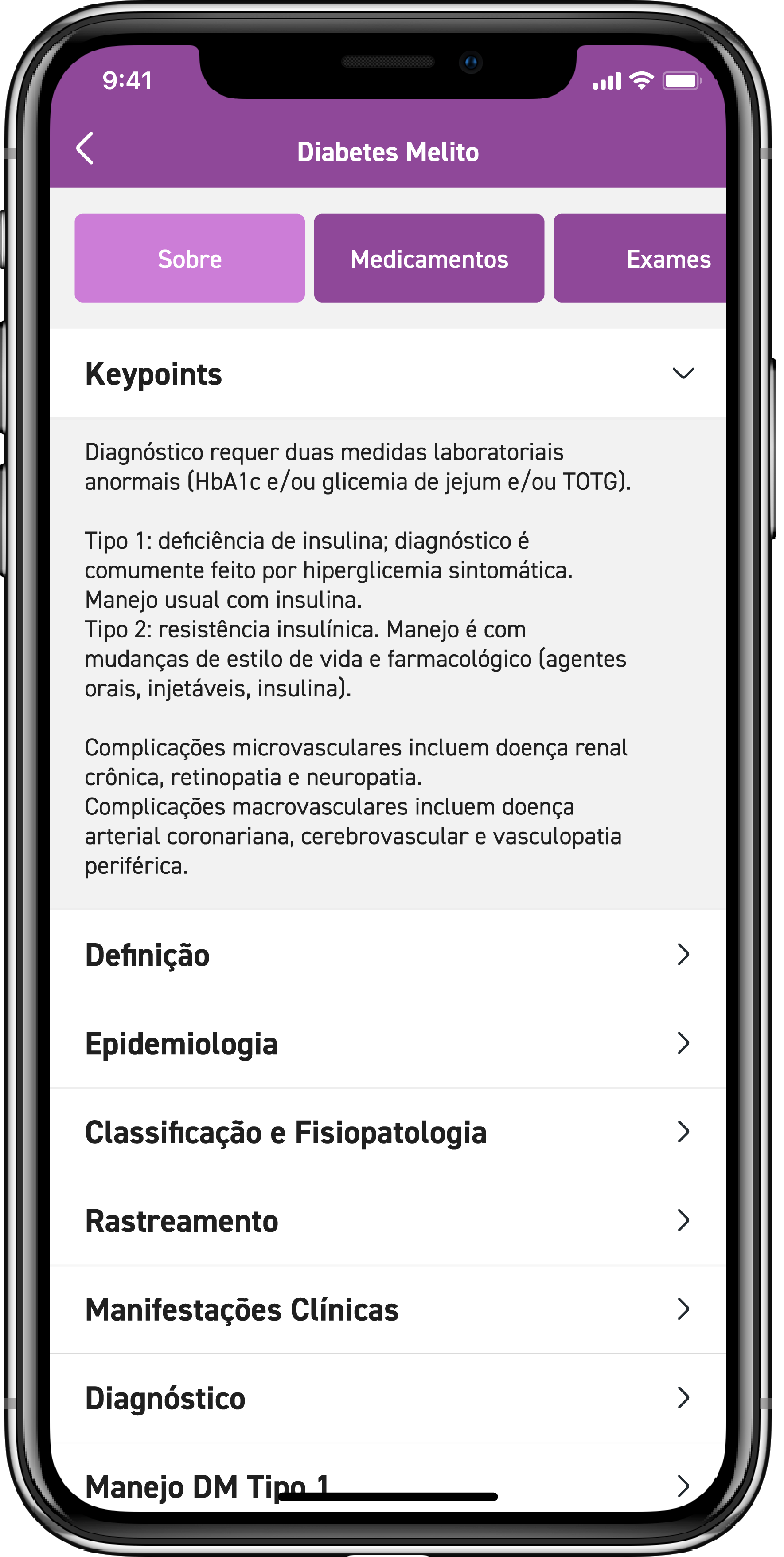
I used the Navigation Bar to better present the filters, containing icons especially designed for the categories and a label to facilitate the understanding. The Tab Bar followed the wireframes, leaving the Search button centralized, thinking about right-handed and left-handed people.

Another important point of the app is the article preview screen. The proposal is to take shortcuts to show content related to the article, such as medications, tests, medical calculators, symptoms, among others. The solution I found was to keep these shortcuts at the top of the screen in tabs, so the user can see all the content without leaving the article searched.
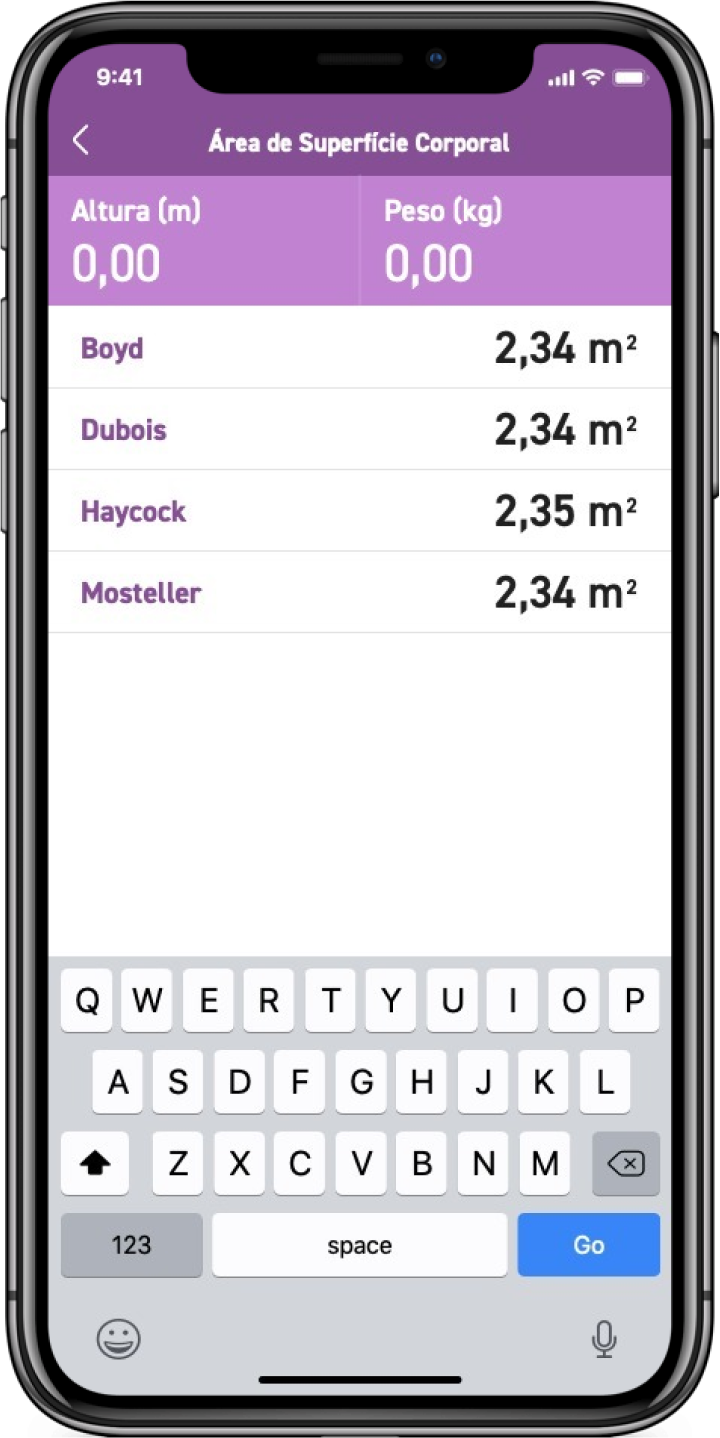
The calculator was designed to follow the same color pattern, with the text inputs in a larger size to facilitate interaction and the results in a list format.
After validating the high-quality prototype, the front-end team applied the design to the programming, with the back-end already aligned, and then the application was placed in TestFlight for user testing.
User testing
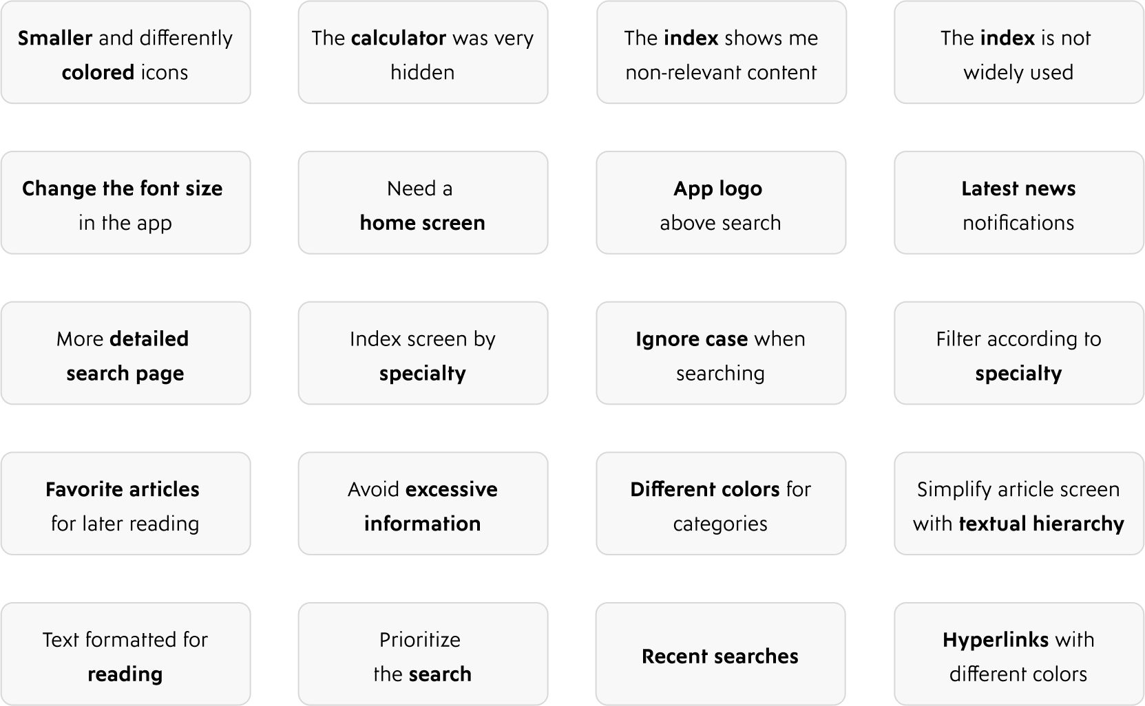
On December 14, the test with users was scheduled. About 11 doctors, mostly from different fields, all with years of experience, were invited. Everyone received problems to be solved using the app. They were instructed to write down any problems that were encountered during the test.
This image is not the actual meeting, due to privacy concerns
After everyone had resolved, a stage of discussion began. So me and the team that was taking the test started to write in post-its and did notes on a board all criticisms and suggestions. We received a lot of layout and flow complaints, what was good for me. That way I was able to discover many problems that I had not noticed, and understand how the user himself uses the application.
the vision
A fast consult, even faster
While our competitors are focused on providing a lot of content, our vision was to help users get a more pleasurable experience. We wanted to become a facilitator for an easier, more complete and reliable consultation.
The framework
Setting the design direction
We took a top‐down approach to defining the overall structure of the experience. Sketching and storyboarding, I generated stacks of ideas about the arrangement of UI, functional and data elements, and interactive behaviours. Starting broad, our vision began evolving into something tangible. A high‐level design language, interactions and the app's anatomy began to piece together.
Similar analysis
With the need for a main screen, I started to search among other similar applications, or with main screens well implemented. Several applications were analyzed, from text size, buttons, content order and navigation.
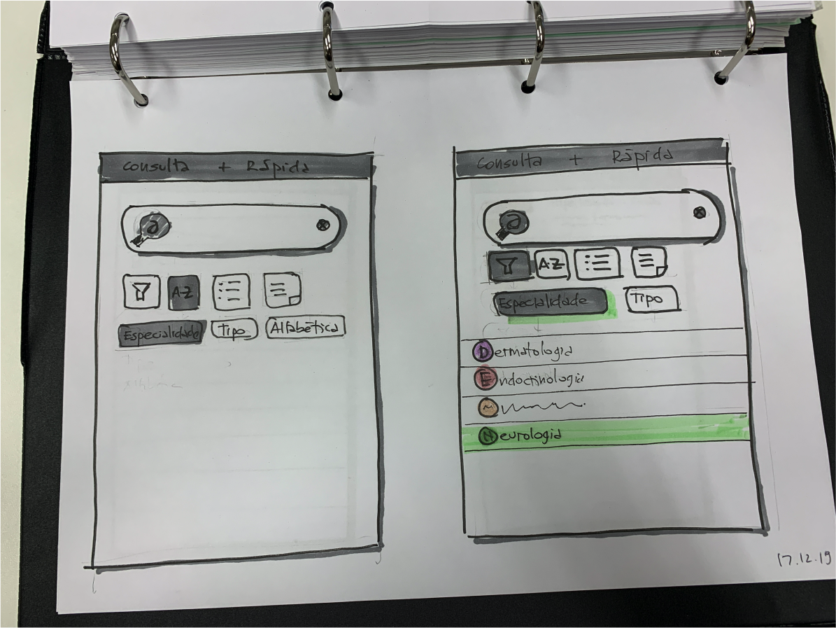
New Wireframes
Few wireframes exploring the new requirements, such as a main screen with sectors ordered by importance, more focus on search and navigation within the article. Because of the pressure of time, I worked quickly, jumping straight from the user test to the development of the new interface.

Not monochrome
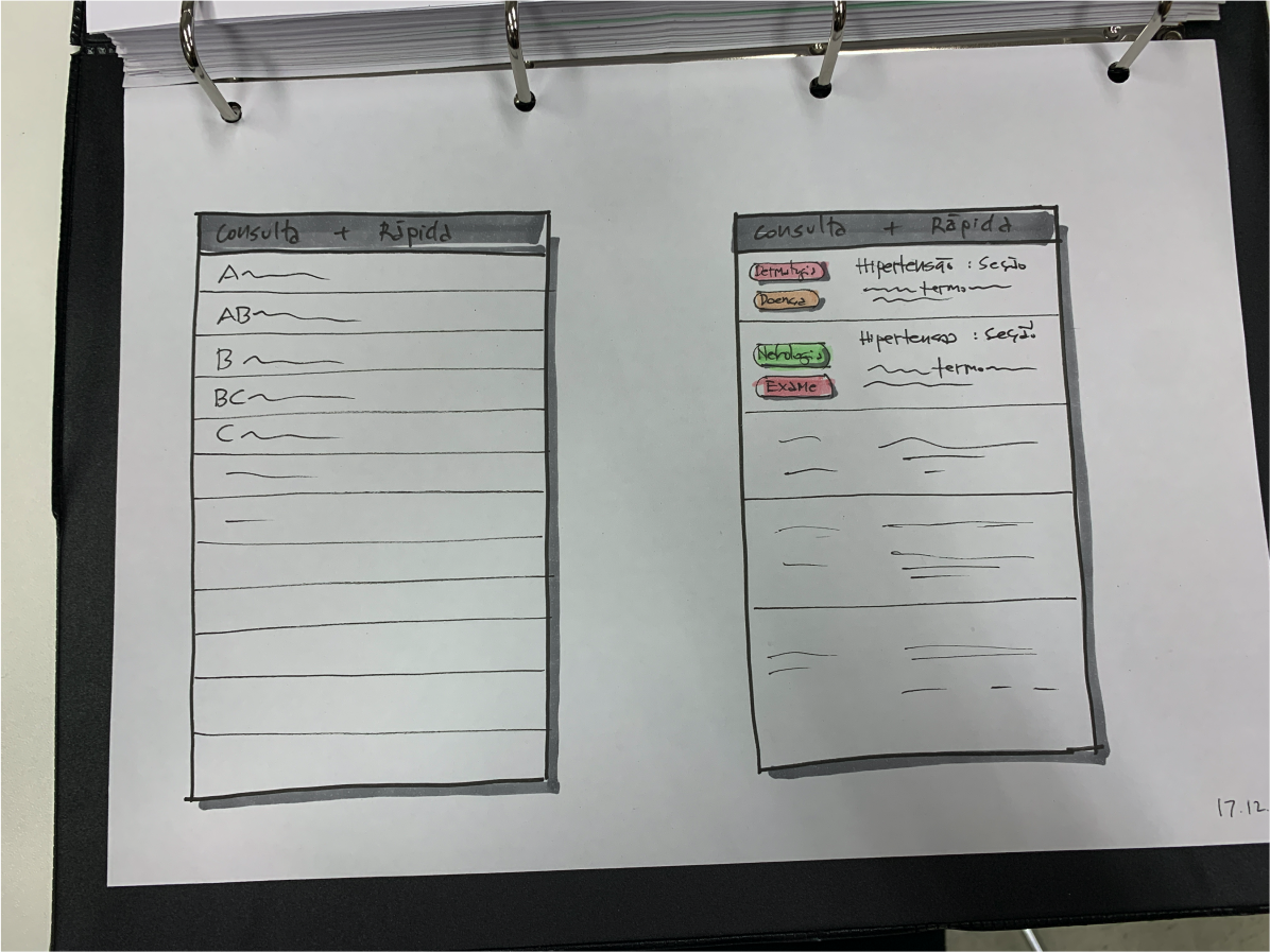
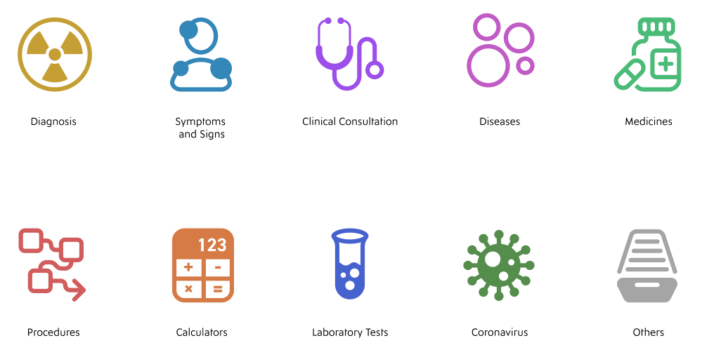
The idea of bringing colors to the categories made sense with user testing. Doctors suggested that the experience could be faster if the colors served as a visual shortcut. So I investigated the books: they all have different colors. My idea then was to combine this requirement with the need to relate to the books, making total sense to me.
After a lot of research with the team, and with doctors from different areas, I managed to define icons that cover all the different medical specialties. For example, the disease icon had first been thought of as a broken heart, but what made sense to a medical cardiologist did not make sense to a pediatric doctor. I also noticed that line icons had a weaker color identification, so I opted for filled icons, with several shades of the same color.
Final prototype
In February, I managed to finalize most of the design changes. Because many content decisions are still happening, it was decided that additions to new categories, new user requirements and new features would continue to happen.
Most of the main screens were finished by me, so I started to implement the final prototype, using Figma. With the link sent, the prototype tested by the team and approved, the front-end team started making code changes.

Detailed design
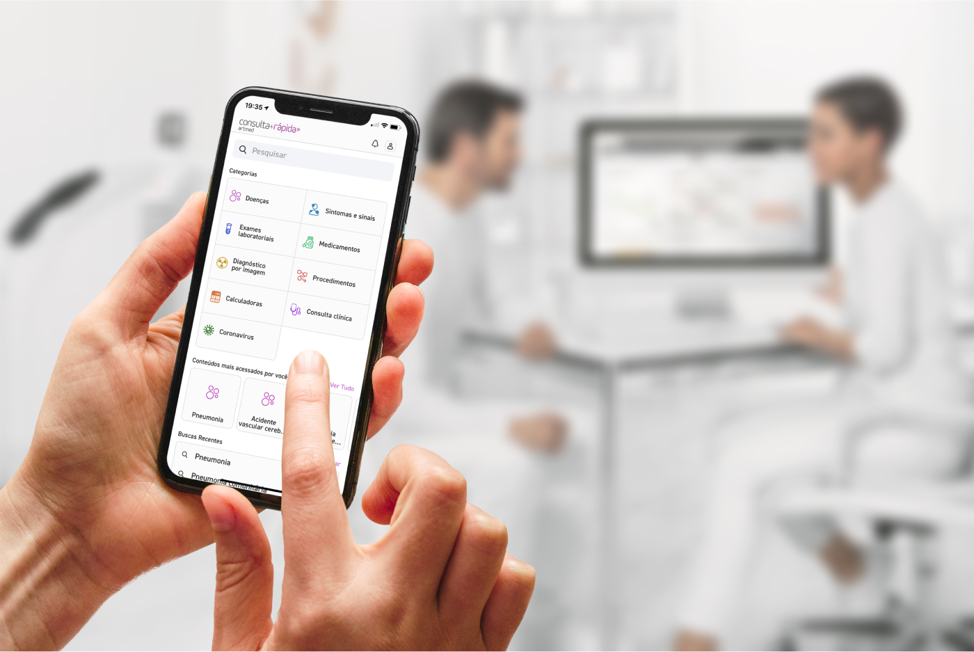
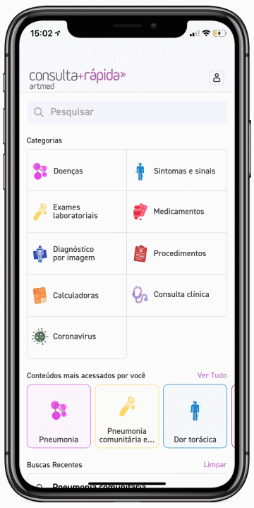
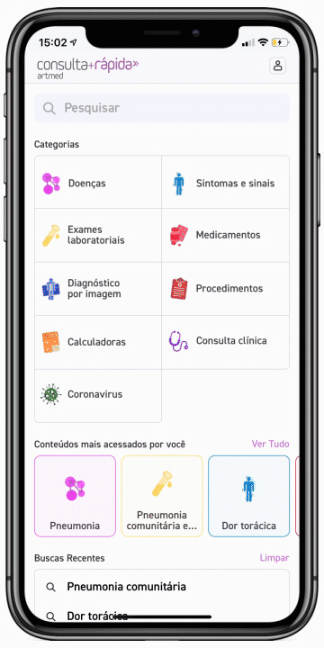
Introducing consulta+Rápida
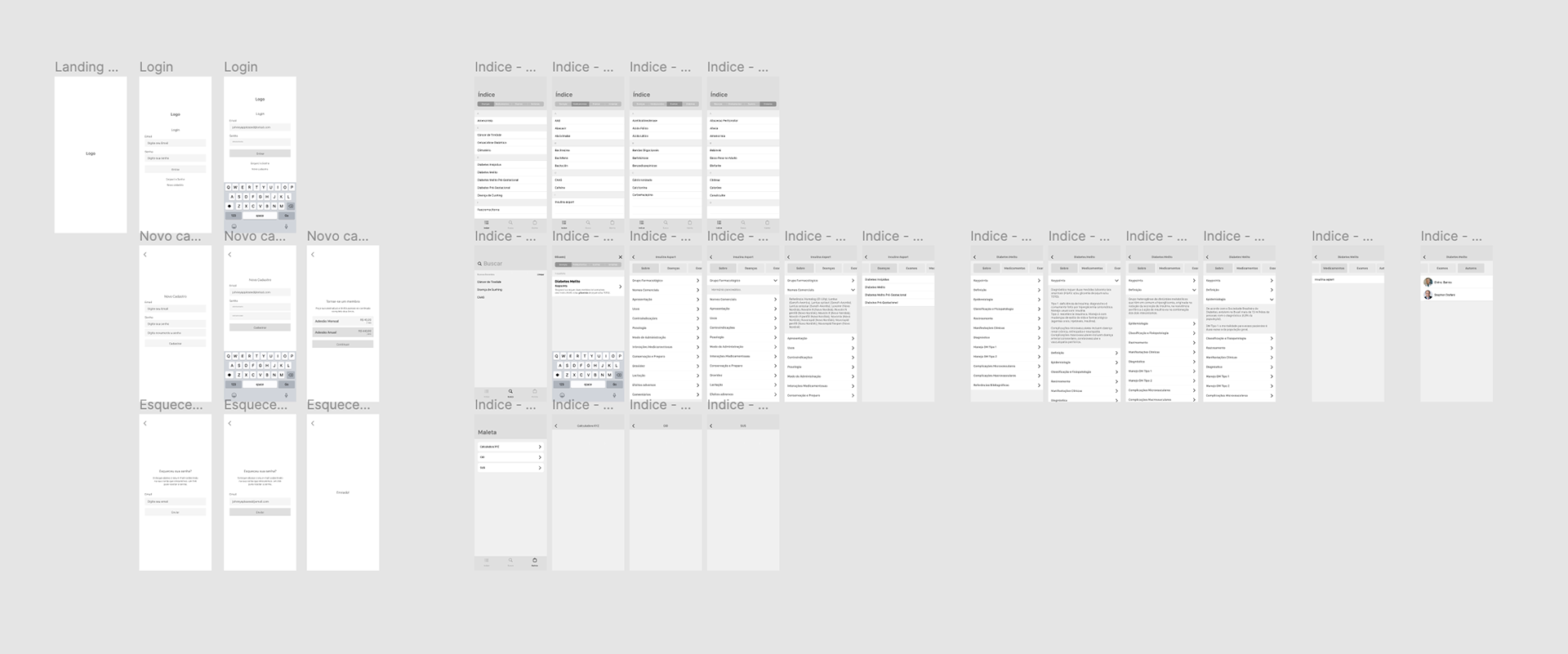
The gallery below shows the final iOS app for launch.
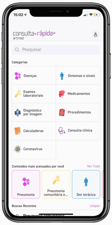
Make important things fast
The main screen has been designed to allow users quick access to primary functions of the application. The size of the icons make tapping easier, the order of the icons are based on ease of reach and the layout was chosen to provide a way for the design to scale for future releases.
Advanced search
Users can perform complete searches with content type filters and medical specialty. All successfully accessed content automatically enters the list of recent searches.
Minimize searching
Primarily designed to provide users with a great search experience, users can rely on their past and favorite searches to help them quickly access content they need most.
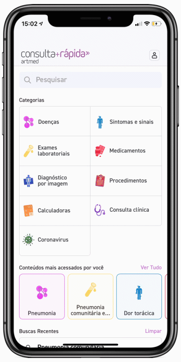
Designed for confidence
The interface design strives to be confident. It does not contain UI‐bling or unnecessary elements. We opted for clear, readable typography —choosing colours with high contrast to increase legibility in outdoor, low‑light conditions. The design is uncluttered, clean, large and well spaced. All our design decisions help to exude a sense of confidence in the design.
The refinements
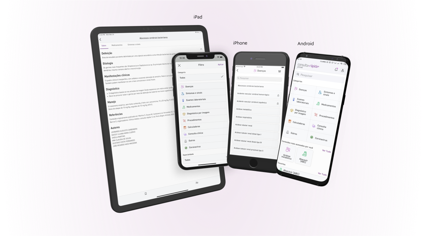
Multiplatform users
Since the project was not only aimed at iPhone users, I had the challenge of taking the project to the Android system. A copy of the screens was made on another page, and I started making changes to adapt the entire interface and experience for the other system. Details such as the navigation bar, modal screens and subscription flows needed to be slightly redesigned.
Because the content is based on books, the amount of text is really large. One of the needs was to adapt the interface for larger screens, such as the iPad. The team and I got together and set width limits for some parts of the interface, new constraints rules, and then new tests were done, this time between the team and the client. All of this work was very well received, bringing a great user experience to many other users.
The impact
Over 5.000+ downloads
The Consulta+Rápida app has received positive feedback since the release. Users have responded really well to the app's features and the simplistic design. Unfortunately, negative feedback largely relates to the subscription price — issues beyond our control and subject to ongoing adjustments.


