Swyft Valet – Web Admin Dashboard
Role: Product Designer (Solo)
Team: 6 total (PM, engineers, stakeholders)
Platform: Web MVP
Timeline: Oct 2021 - April 2022
Overview
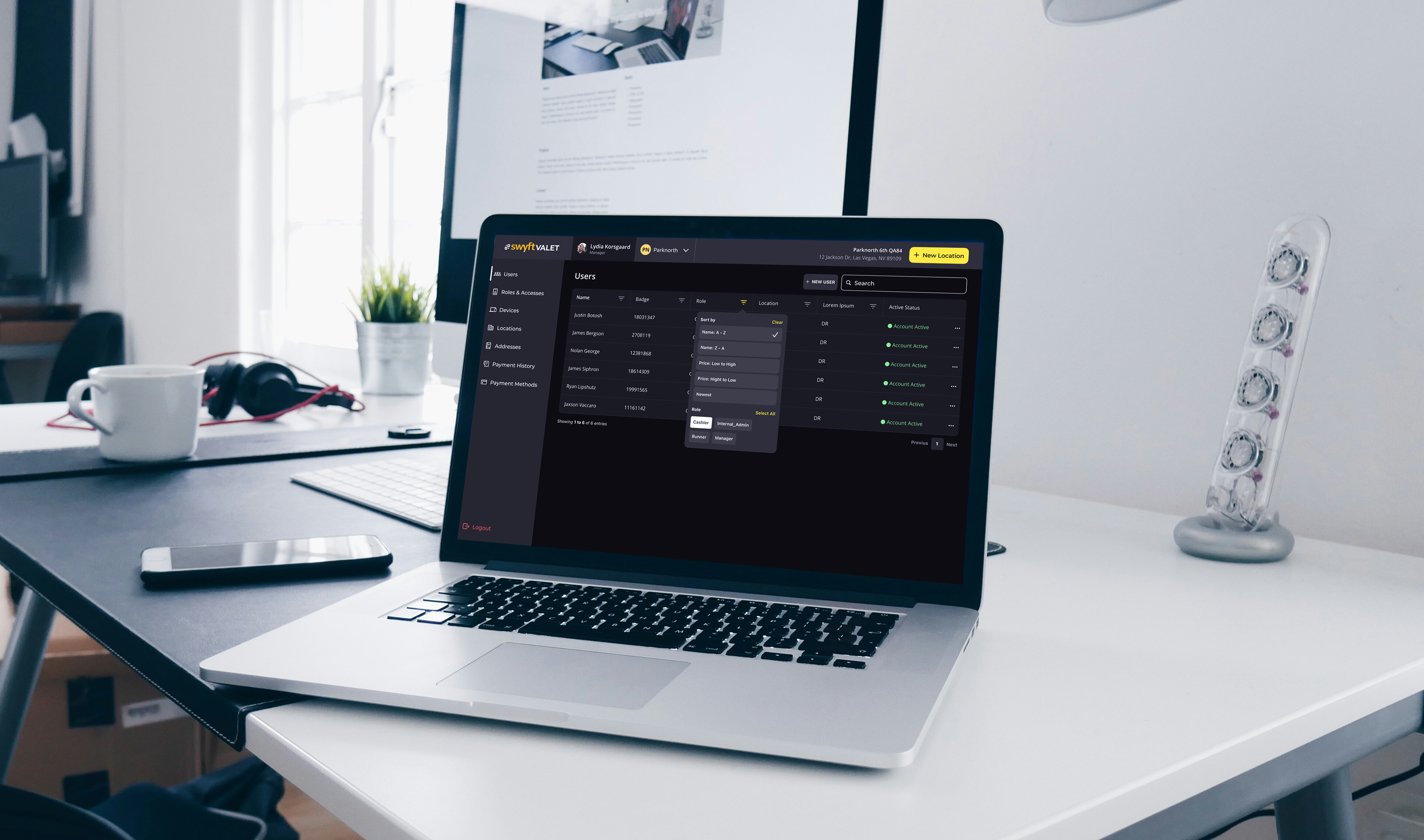
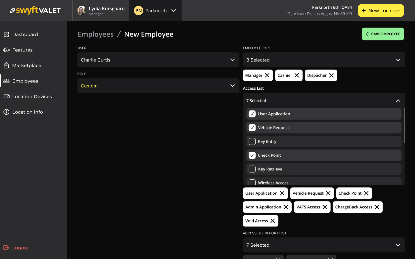
Swyft Valet is a platform for managing valet operations, primarily used by staff, runners, and location managers. Originally a mobile-first app, the product was expanding into a full-featured web application. I was responsible for designing the Users Dashboard—a critical tool for managers to oversee staff, assign roles, and track active accounts.
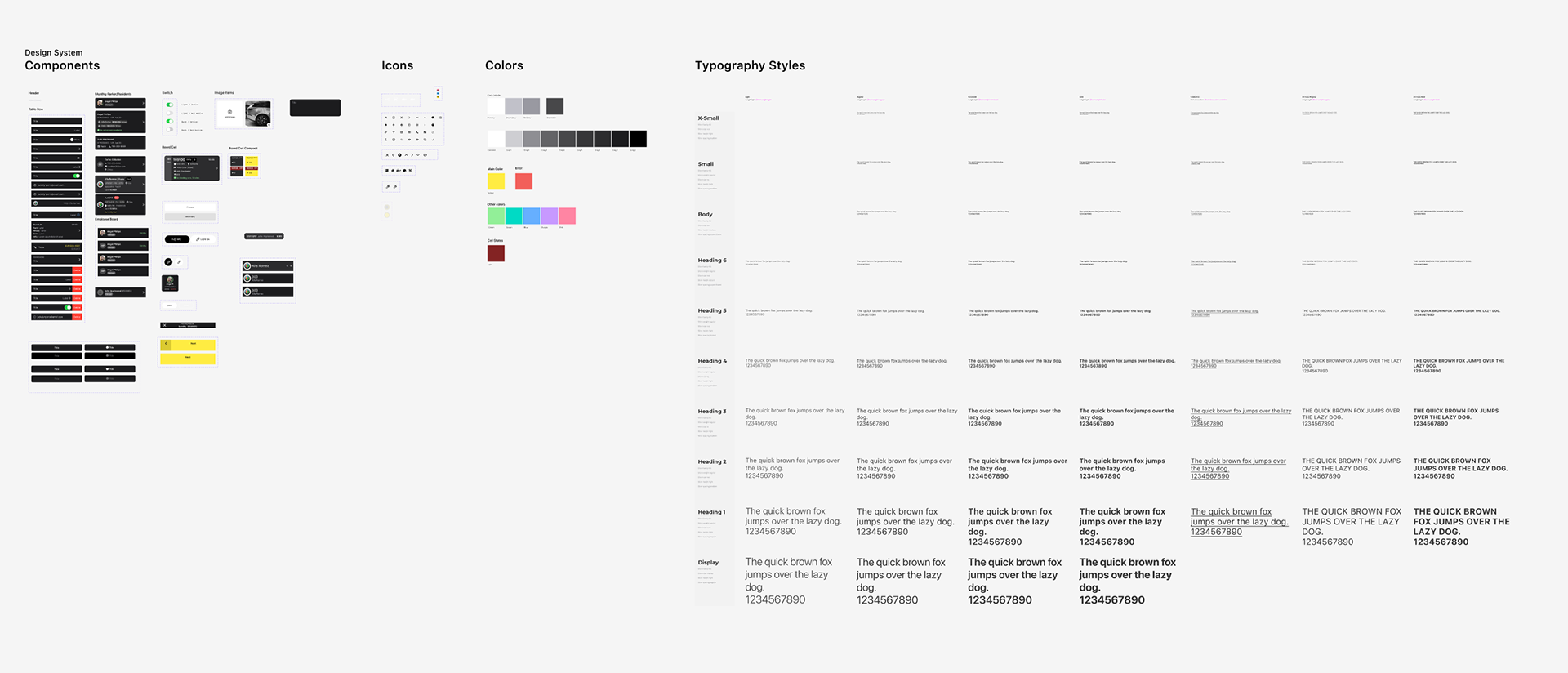
This was the first time the platform made the leap from mobile to desktop, and it came with the opportunity to build a foundational design system from scratch.

The Problem
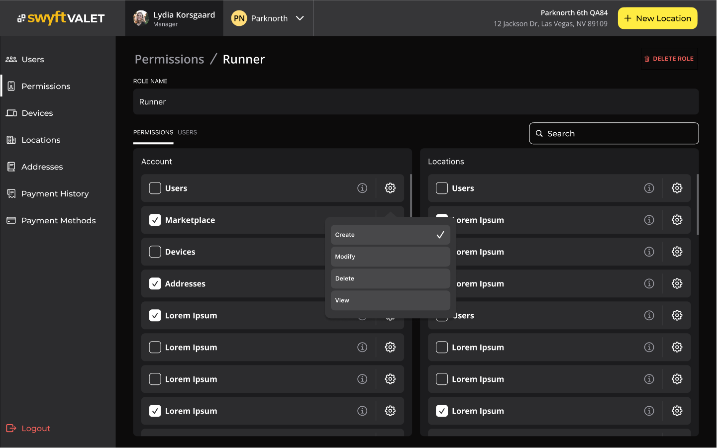
The mobile app’s user management features were becoming too clunky for the growing complexity of the operation. Different user roles (cashiers, runners, internal admins, etc.) each had their own permissions and interfaces, but there was no consistent structure tying them together.
Managers—our primary audience—struggled to quickly find, filter, or modify users, especially in locations with dozens of active employees. The existing UI was inefficient, and lacked accessibility and scalability.

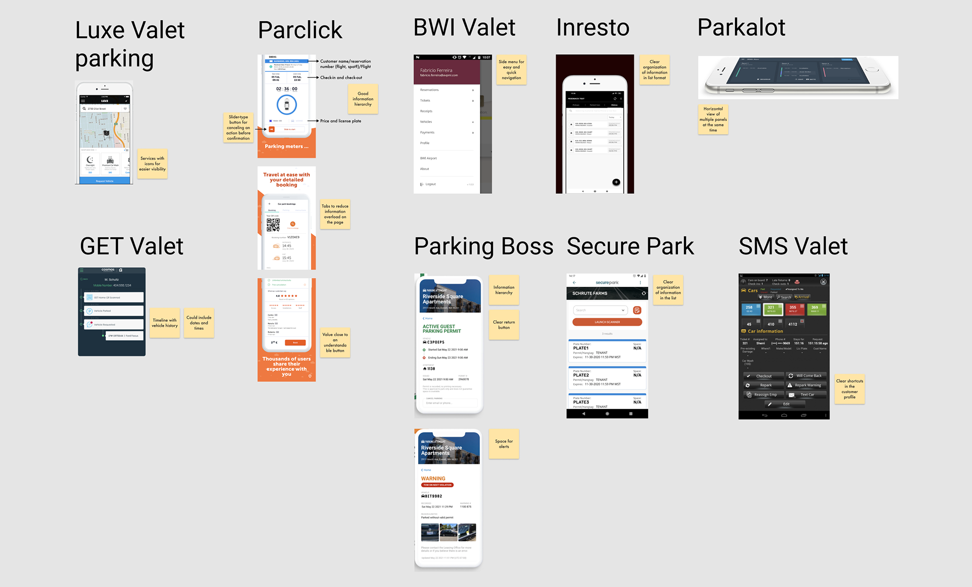
Discovery & Research
Before designing, I led:
- User interviews with managers and internal staff to uncover pain points in the current system.
- Competitive analysis of admin dashboards from other SaaS platforms to benchmark filtering, sorting, and role management features.
This helped us define key goals:
- Prioritize data density without overwhelming the UI.
- Make roles, filters, and statuses clear at a glance.
- Build a scalable visual system that could support future modules like payments, devices, and locations.
My Design Approach
As the solo designer, I focused on making usability the center of the experience. Key design decisions included:
- Large, touch-friendly buttons to improve click targets.
- Clear icons and strong contrast to make the interface more scannable.
- Flexible filters and sorting, allowing managers to quickly find users by role, badge, or location.
- Status color coding (e.g. green for active) to offer visual clarity with minimal cognitive load.
- Early component thinking, setting up a foundational design system to unify future features and maintain consistency.
We scoped the MVP for desktop-first, with the intention to later develop mobile responsiveness.
Testing & Iteration
We validated the designs through internal testing:
- Colleagues from unrelated projects gave feedback on usability and information clarity.
- Stakeholders and developers gave early buy-in to design patterns, enabling fast handoff.
- Other designers in the org reviewed UI polish and interaction flows.
Based on this feedback, I iterated on spacing, typography scale, and simplified the filter dropdown to reduce friction.
Outcome
Although I left the project before final metrics were collected, early testing and internal feedback pointed to several wins:
- Cleaner experience with visually grouped elements and role-specific sorting.
- Faster task completion by reducing the need to click into each user.
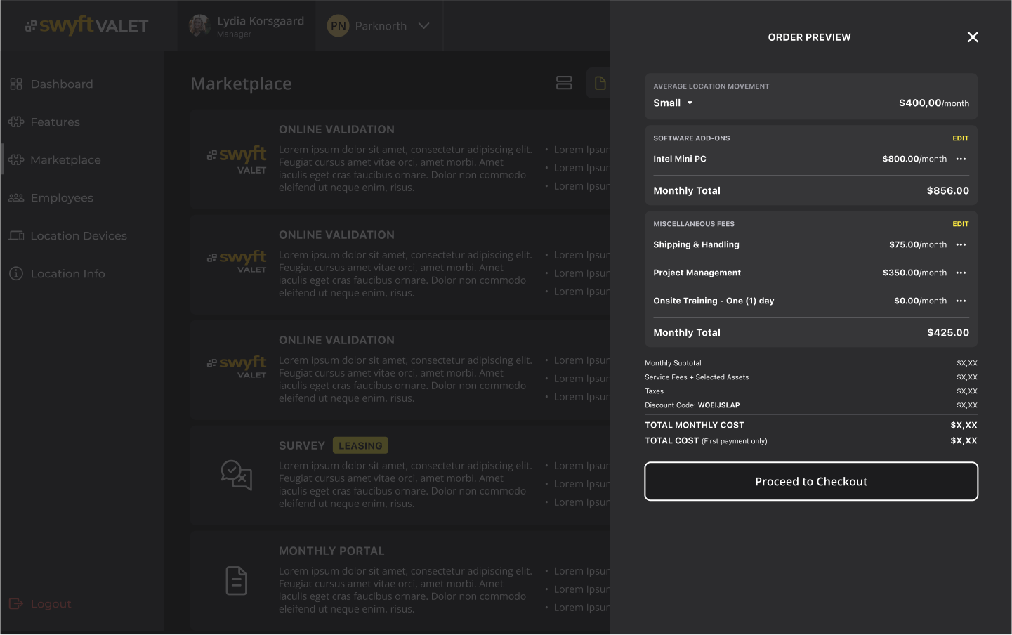
- A scalable design system, setting a foundation for future modules like payment methods, devices, and locations.
Managers could now filter through users easily, assign roles with fewer clicks, and trust the UI to reflect real-time account status with visual clarity.


Reflection & Next Steps
What I’m most proud of is the cohesion and polish of the interface. Establishing a design system elevated the experience far beyond our competitors, and gave the team a professional, future-ready foundation.
If I had stayed on the project, I would have pushed to:
- Expand the dashboard to mobile web use cases
- Add usage analytics to guide further iterations
- Introduce bulk actions and deeper permission settings