Walkairos, UX, UI
A brand new
travel tool
The brief was to create a new travel app, bringing several tools to facilitate the travel, designed with an elegant aesthetic and amazing user experience. As a sole designer on the project, I was responsible for UX and UI design.
The Challenge
The first big challenge in developing Walkairos was setting the minimum features for launching the app in six months. As we had in the middle of a pandemic, working remotely, me and my team did user research, so we were able to confirm not only people's interest in returning to travel but also possible interesting features and tools for the app.
The second challenge was balancing style with a thoroughly sleek and efficient user experience. Aesthetically and strategically there was a space for the product in the market. We did know the possibilities and limitations for the development, so our aim was to ensure a consistent experience for the users.
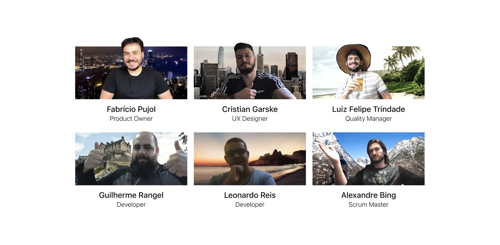
The initial Walkairos team
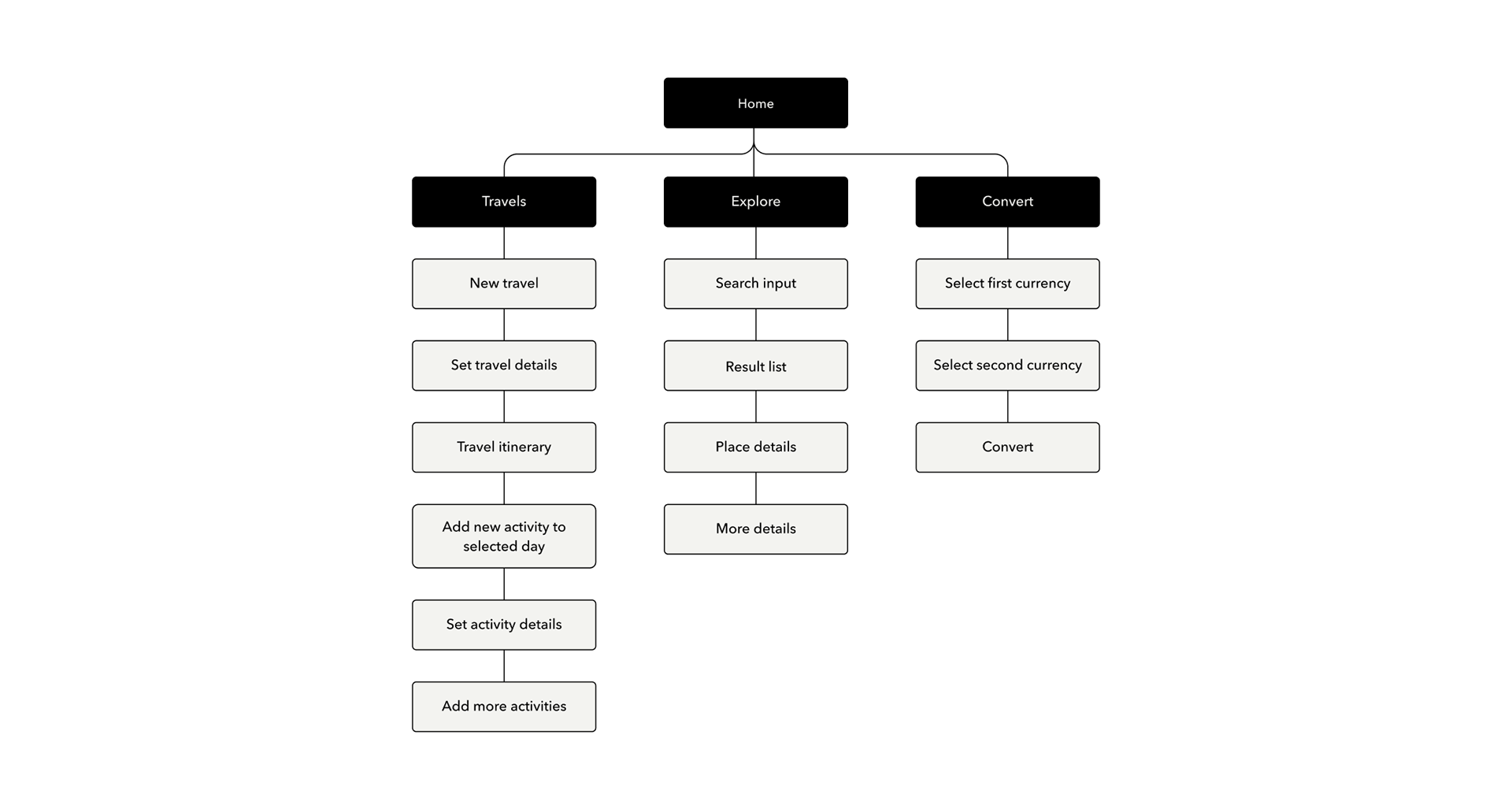
An initial simple and well structured sitemap gives the team visualization before the development.
Design Process
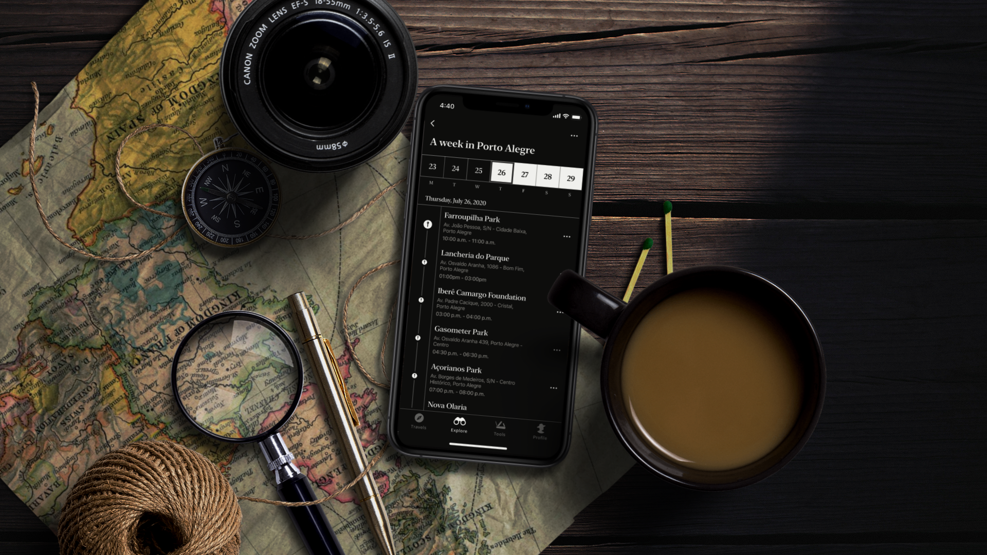
From our user research, we've discovered two things. Number 1 - Majority of users really feel tiring planning travels. Number 2 - they all use different tools to organize the expenses. We've decided to organize the Minimum Viable product in a way that the users can have the basic for planning an itinerary and doing currency conversion.
With the app being developed through sprints, we thought about features to be added throughout the development, in an increasing way, prioritizing the main tools of use in a travel.

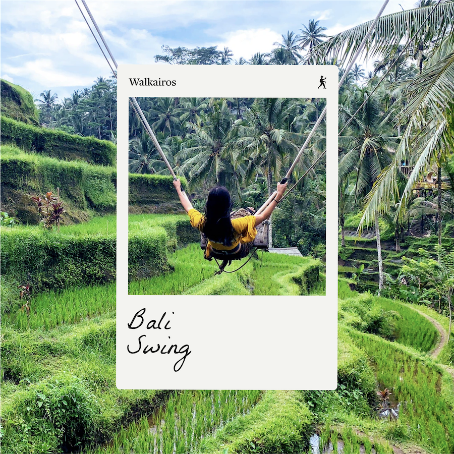
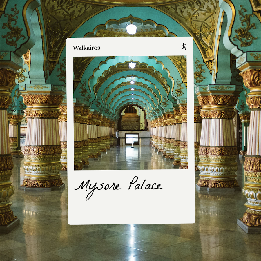
Walkairos comes from Walk + Kairos (an Ancient Greek word meaning moment). The symbol reflects the Walkairos user: a traveller by nature, with the support of technology.
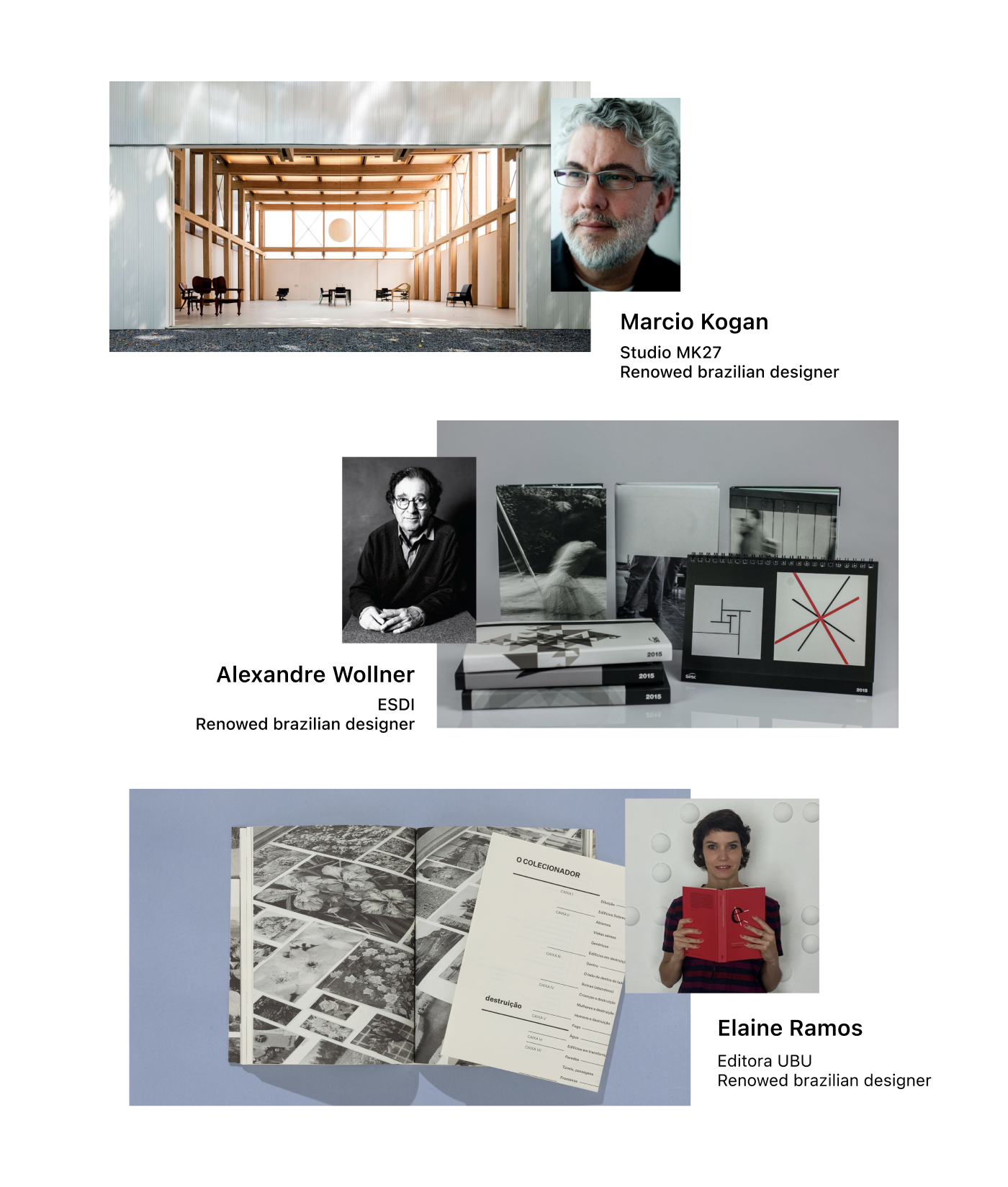
Analyzing similar apps on the market, I tried to evade the same visual proposals. Looking for different references, I found a clean, elegant and typographic look very interesting.
I searched for works by other Brazilian designers, and found some brilliant architecture, typography and editorial design projects.
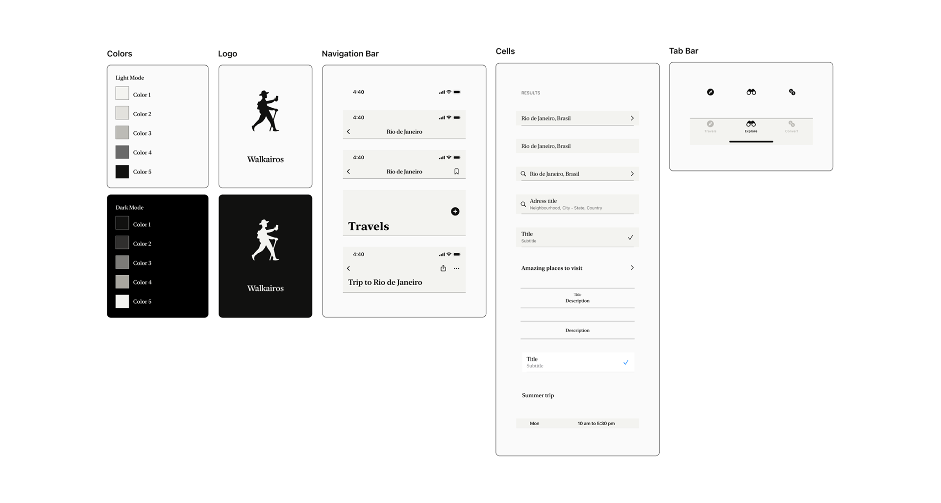
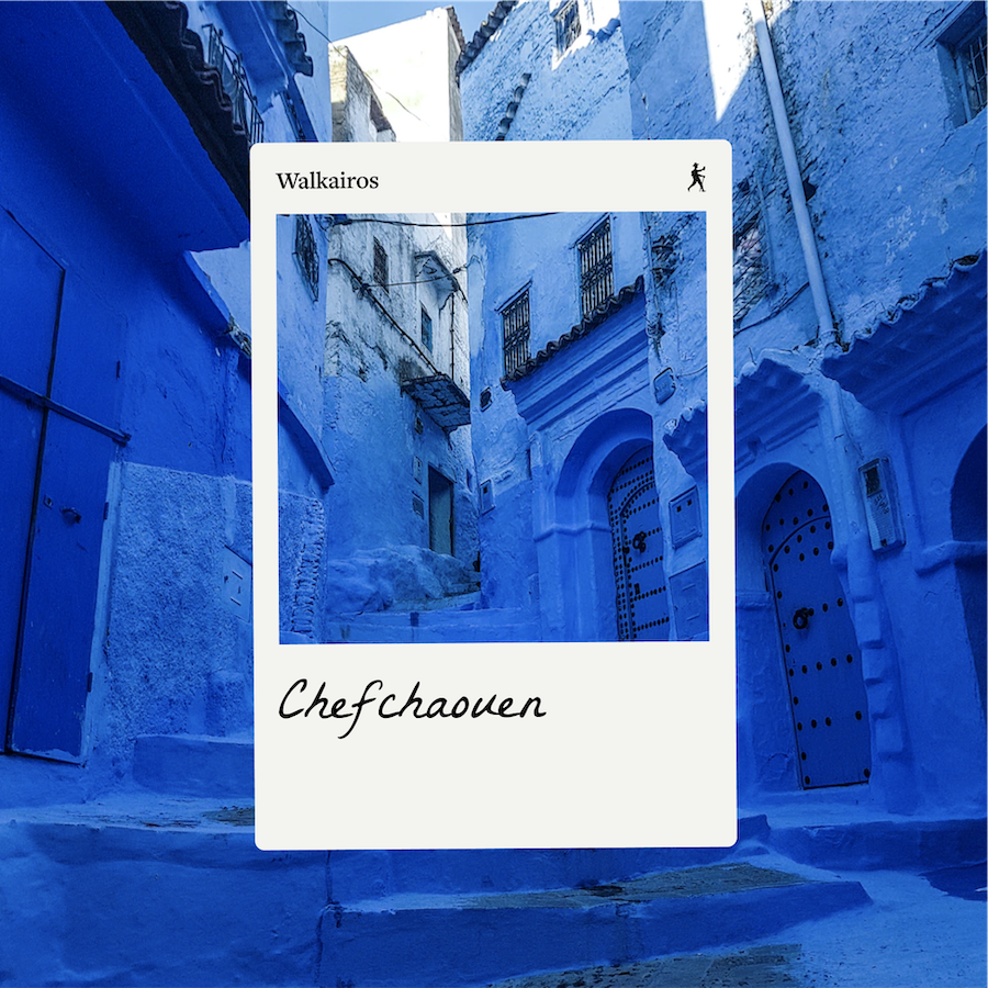
A design system was created as soon as the name, symbol and art references were defined. I selected the FreightText font as the main typeface and San Francisco font for the smaller elements or those that need a better reading experience.
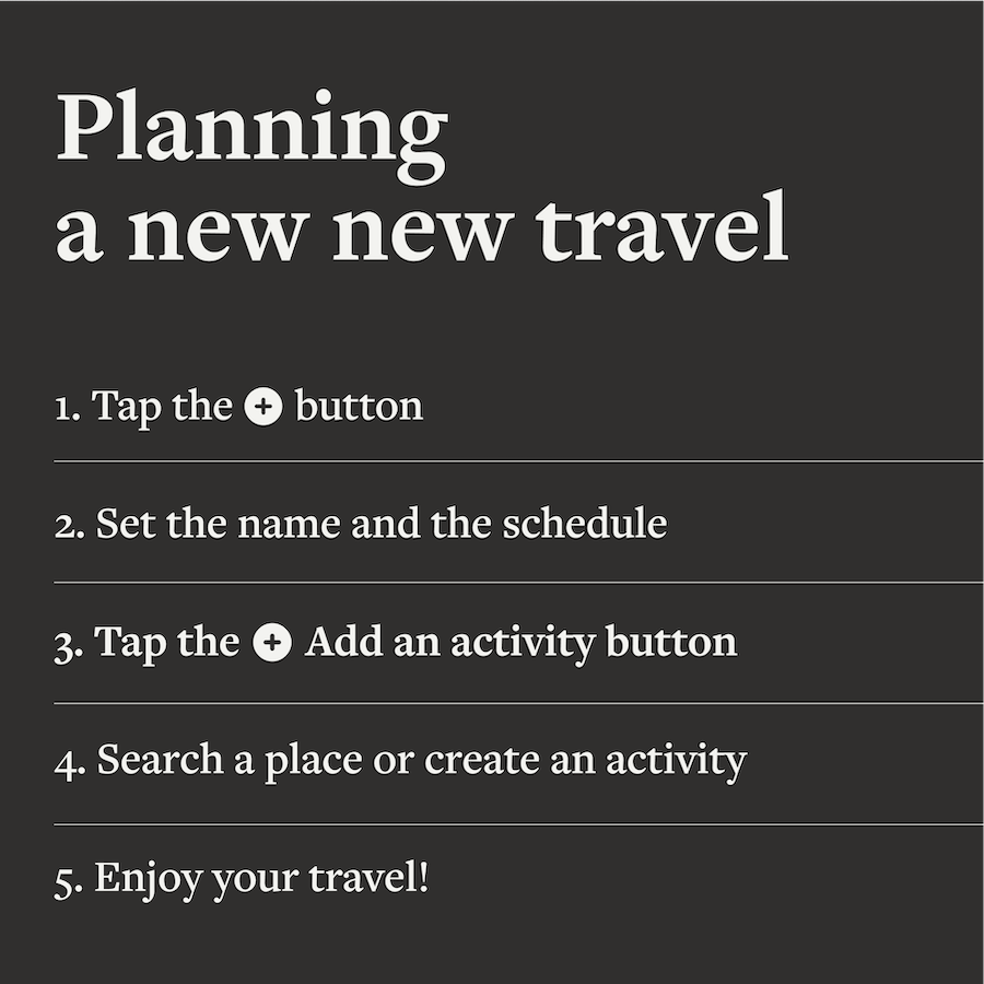
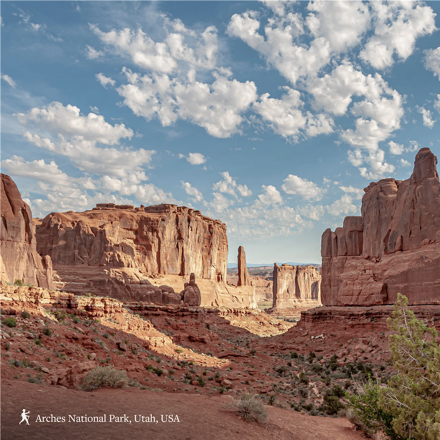
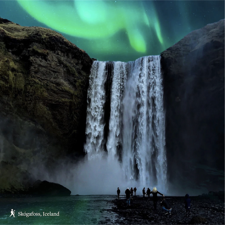
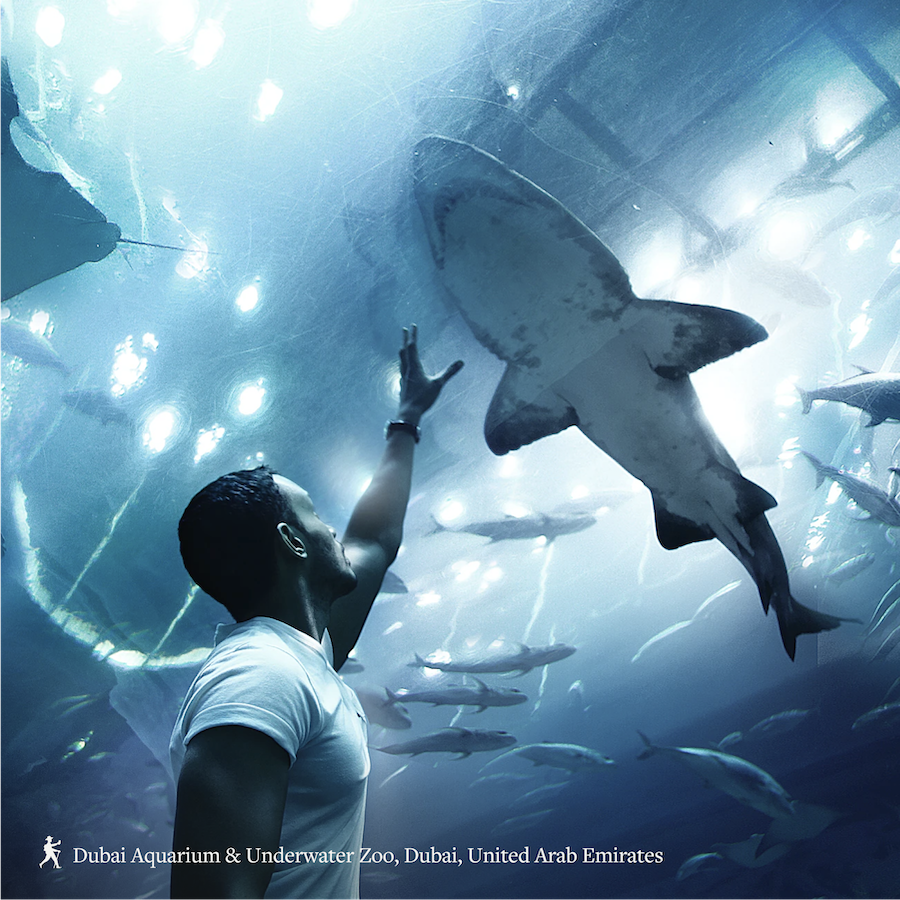
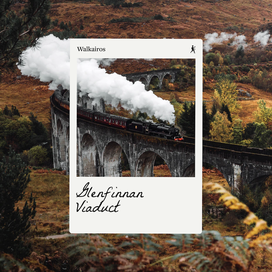
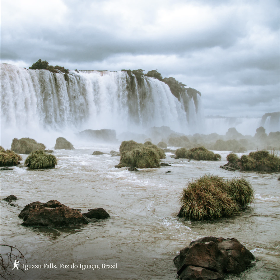
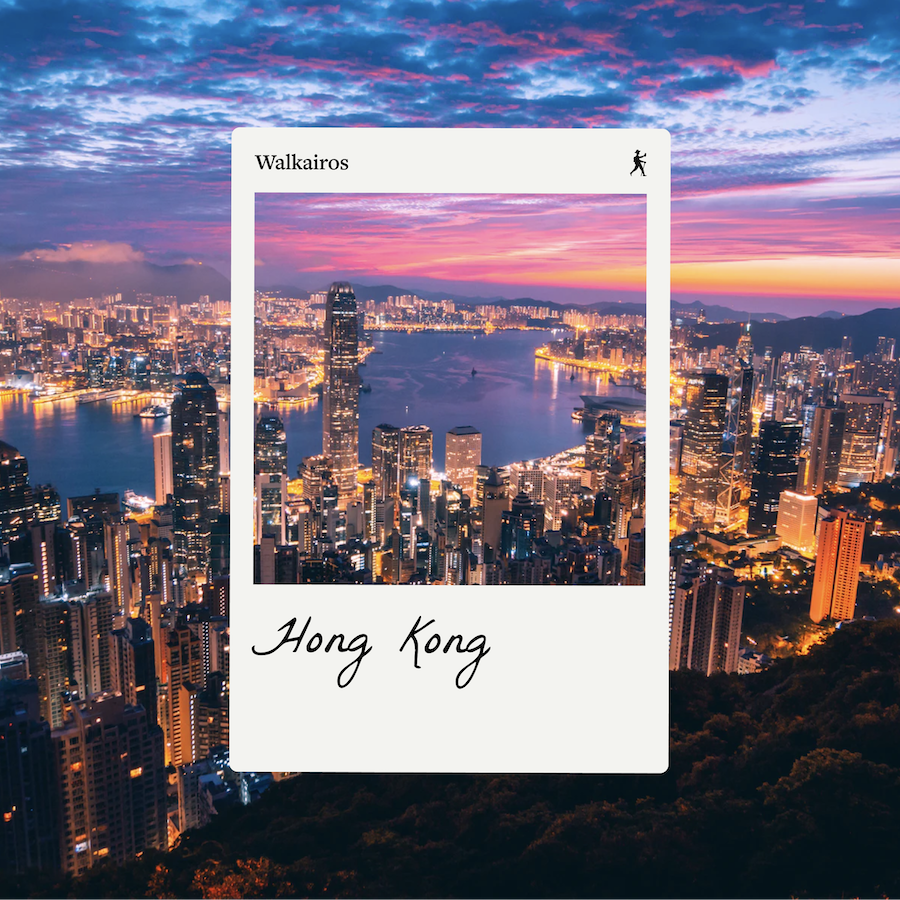
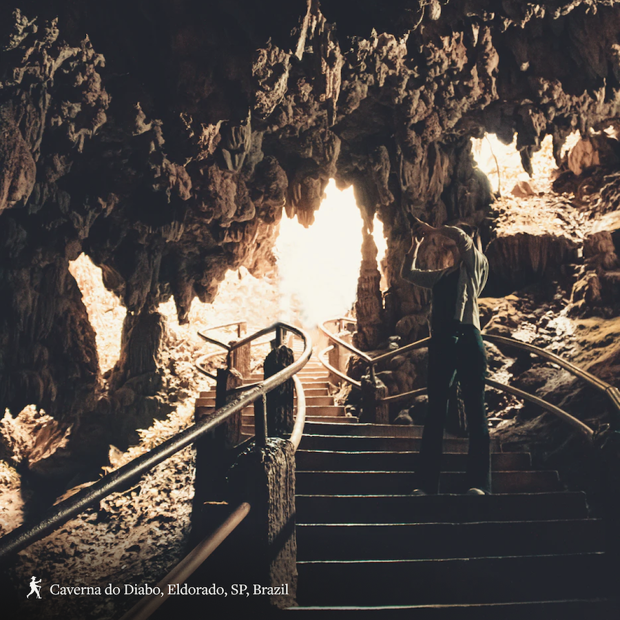
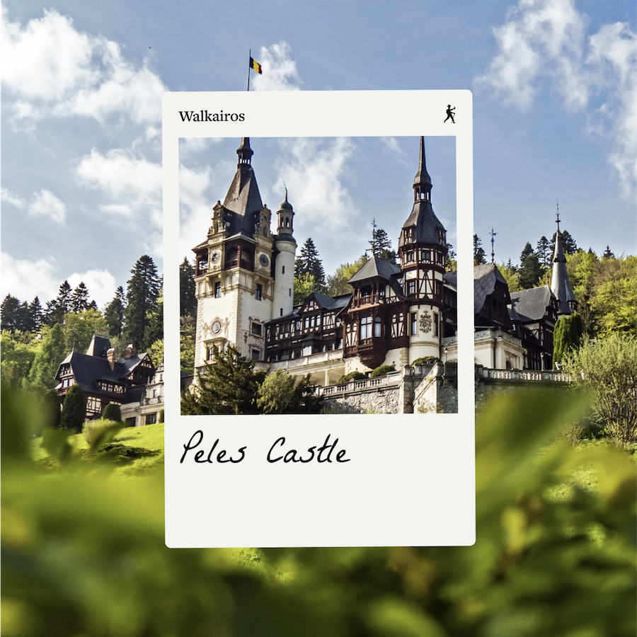
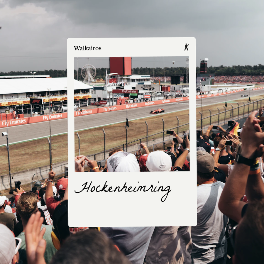
While the app was being developed, I defined a marketing plan for the product. Using the Instagram platform, the idea was sharing tips on interesting places to be visited around the world, and posts about the project development.
Also, understanding that the time of travel was difficult due to the pandemic, we tried to bring awareness messages, such as wearing masks and good research on destinations.

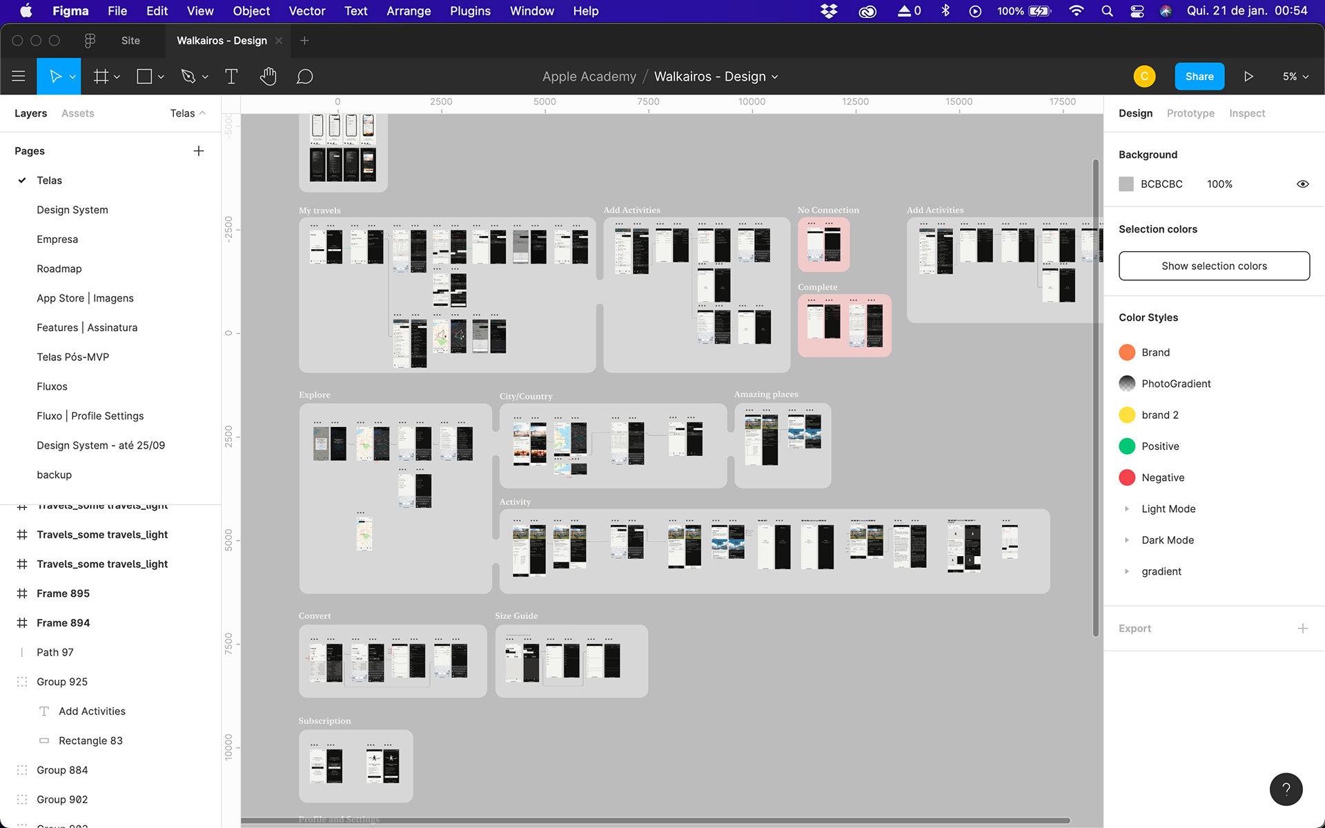
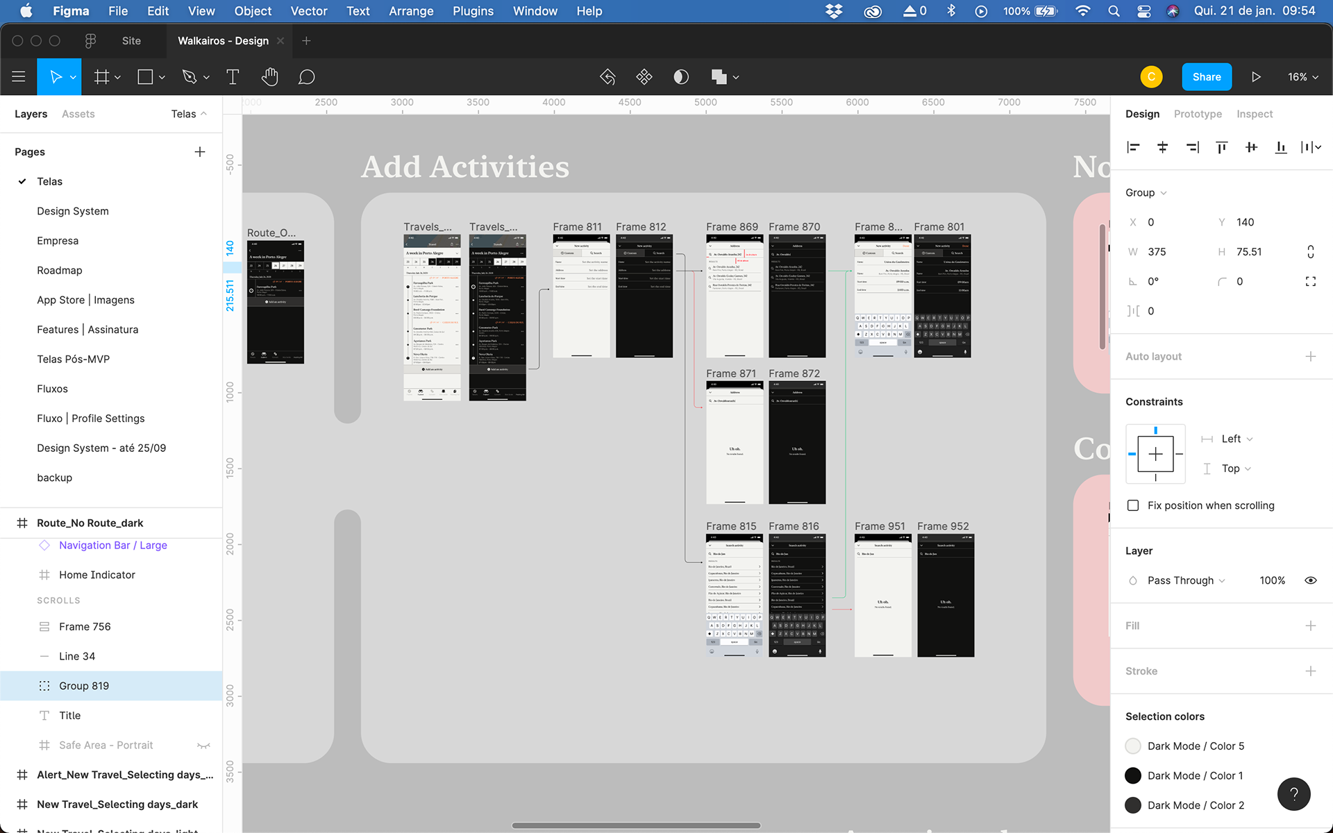
Using Figma, the team had a quick and easy way to access screens and interface elements. I organized each section of the product in blocks with a title, making it easier to identify the necessary screens.
The Result
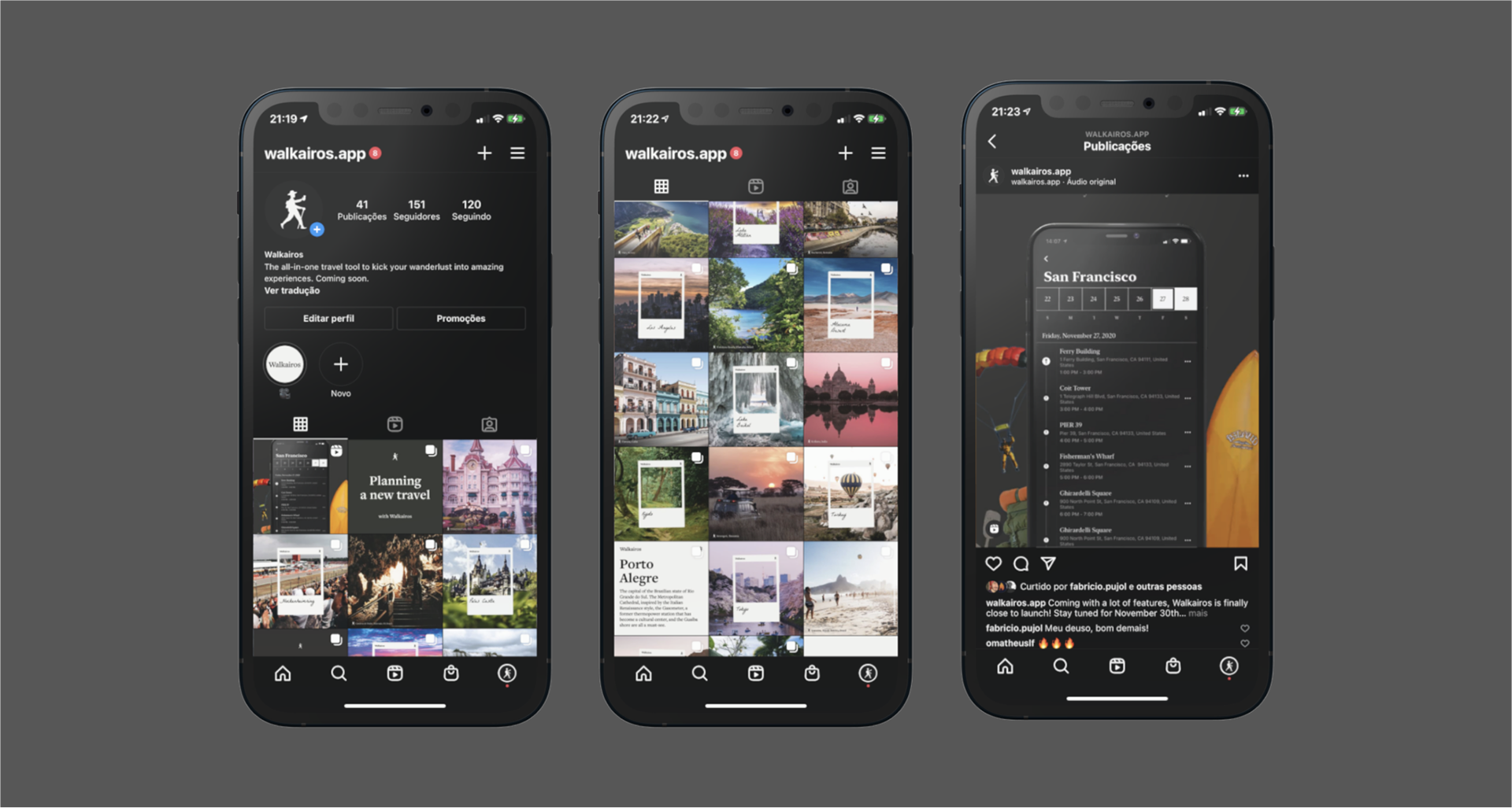
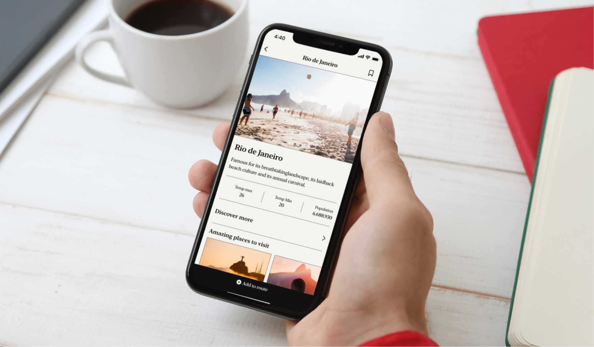
A travel app prepared for the future with a sense of simplicity and purpose. Affordable navigation ensuring a perfect user experience.

Feel free to download Walkairos on the App Store! While it is designed for iPhone, the team is working on the iPad and Android versions.